
Color Psychology in Interior Design: Choosing the Right Palette for Every Room
Color Psychology in Interior Design: Choosing the Right Palette for Every Room
Color influences how a room feels long before we notice its furniture, lighting, or decorative details. Neutral shades can create visual calm, warm colors can make a space feel welcoming, and cool tones can encourage rest or concentration. Understanding these effects makes it easier to choose a palette that supports the purpose of each room while keeping the whole home visually connected.
Start with the Purpose of the Room
Before choosing paint or accessories, consider how you want to feel in the space. A bedroom may need to encourage rest, while a kitchen can benefit from a brighter and more energetic palette. A home office should feel focused without becoming cold, and a living room usually needs a balance between comfort and personality.
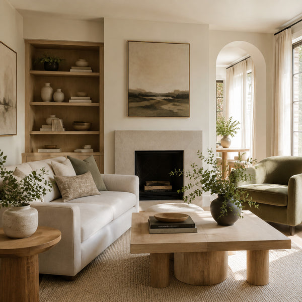
1. Warm Neutrals for a Calm Living Room
Ivory, oatmeal, beige, warm grey, and light wood create a relaxed foundation for living rooms. These colors reflect natural light and allow furniture, artwork, and plants to become gentle focal points. Olive green or muted brown accents can add depth without disturbing the peaceful atmosphere.
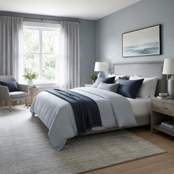
2. Cool Blues for a Restful Bedroom
Misty blue, soft grey, and white are commonly associated with quiet and relaxation. They work especially well in bedrooms because they reduce visual intensity and create a clean, restful environment. Small navy accents can provide contrast while maintaining the calm character of the room.
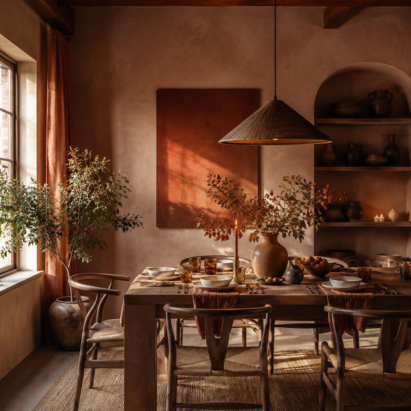
3. Terracotta and Rust for Welcoming Dining Spaces
Warm colors such as terracotta, muted rust, caramel, and clay can make dining rooms feel sociable and intimate. These earthy shades pair naturally with wooden furniture, linen textiles, handmade ceramics, and warm ambient lighting.
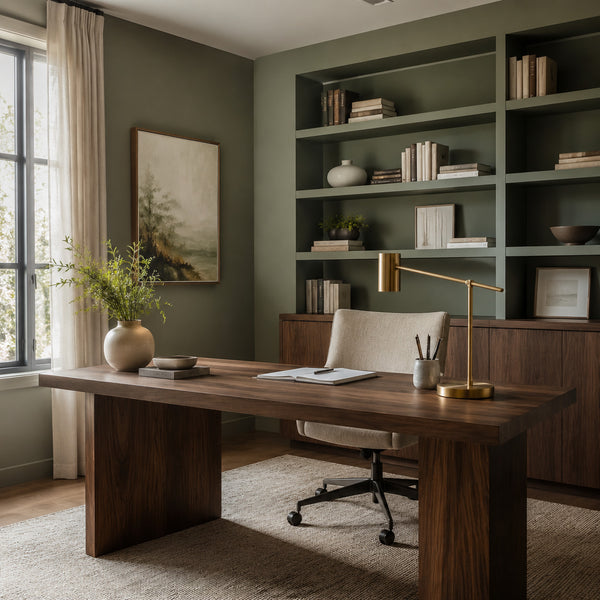
4. Sage Green for Focus and Productivity
Muted green connects an interior with nature and can create a balanced environment for concentration. In a home office, sage walls combined with walnut furniture, warm white textiles, and brass task lighting feel focused, comfortable, and sophisticated without becoming overly formal.
5. Soft Yellow for an Energetic Kitchen
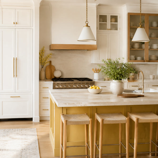
Yellow introduces optimism and energy, making it a useful accent for kitchens and breakfast areas. Instead of using an intense shade throughout the room, consider soft butter yellow on an island, cabinet section, or decorative accessories. Creamy white and natural oak will keep the result balanced.
6. Pale Blue and Aqua for a Spa-Like Bathroom
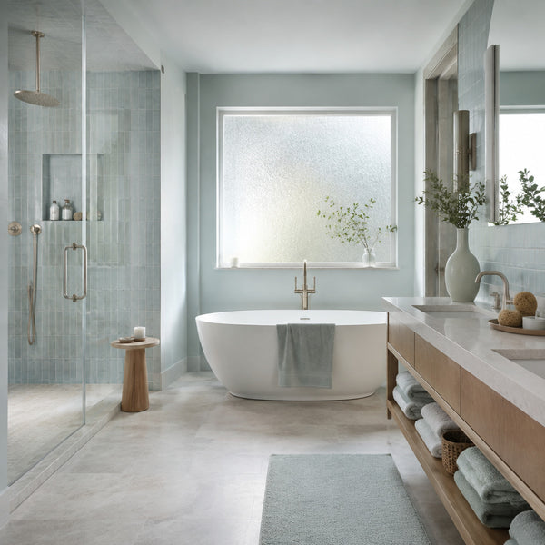
Cool aqua, pale blue-grey, white, and light stone can give bathrooms a fresh and restorative quality. These shades work particularly well with frosted glass, natural wood, brushed metal, and soft cotton towels, creating a clean atmosphere without feeling clinical.
7. Jewel Tones for Intimate Reading Areas
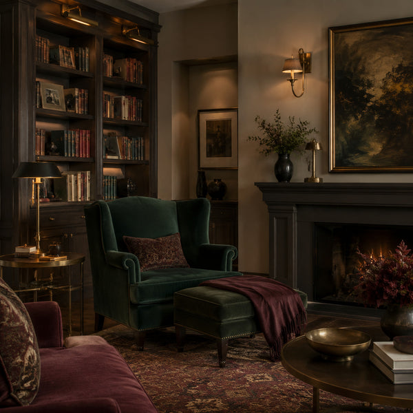
Deep forest green, muted burgundy, warm brown, and antique brass create a rich and enveloping setting. These darker colors are ideal for reading rooms, libraries, and evening lounges where layered lighting and tactile materials can produce a more intimate mood.
How to Build a Balanced Color Palette
- Choose one dominant color to establish the overall atmosphere.
- Add one or two supporting shades for furniture and larger textiles.
- Use a stronger accent color in cushions, artwork, ceramics, or lighting.
- Repeat key colors in several areas to make the room feel connected.
- Balance warm and cool tones with natural wood, stone, or neutral fabrics.
- Test paint colors under both natural and artificial light before deciding.
- Consider adjoining rooms so the transitions between palettes feel intentional.
Use Color as a Practical Design Tool
The right palette is not simply the most fashionable combination. It should support the room’s function, respond to its lighting, and reflect the atmosphere you want to create. By combining color psychology with natural materials and carefully chosen accents, every room can feel distinctive while remaining part of a coherent home.